XI Wiki


The effects in game look pretty snazzy, but it kinda looks like a boomerang....
Awesome job though!
- Navigation
+ Reply to Thread
Results 2581 to 2600 of 3068
Thread: Show me those .dats!


-
2013-02-10 14:47 #2581Leader of the Brain Eating Space Monkeys
- Join Date
- Dec 2009
- Posts
- 429
- BG Level
- 4
- FFXI Server
- Ramuh


-
2013-02-10 14:55 #2582Melee Summoner
- Join Date
- Jan 2013
- Posts
- 45
- BG Level
- 1
- FFXI Server
- Sylph
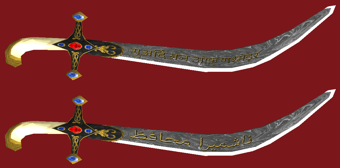
 yea rather than starting the texture map from scratch I just modified the existing map a bit. It stretches the last 1 1/2 letters and the gems aren't exactly perfect but saved me a few hours work. I'll likely clean it up a bit eventually, for now was more interested in seeing how the effects worked together.
 Originally Posted by Stromgarde

The letters are sanskrit, isn't a real translation, just transliterated the letters, but the hume one says guardian of Nashmeira, the taru one says Jimbobsonofgod
-
2013-02-11 12:21 #2583Insert witty title here
- Join Date
- Jun 2007
- Posts
- 1,193
- BG Level
- 6
- FFXI Server
- Phoenix
The effect on hit looks amazing. :Q
-
2013-02-11 14:16 #2584RIDE ARMOR
- Join Date
- Mar 2012
- Posts
- 12
- BG Level
- 1
Thank you sooooooooooooooo much Godly! I'll try them out ASAP!
-
2013-02-11 19:36 #2585The Tower
- Join Date
- Apr 2005
- Posts
- 2,160
- BG Level
- 7
- FFXIV Character
- Stromgarde Siren
- FFXIV Server
- Gilgamesh
- FFXI Server
- Siren

gtt would you happen to have the raw text available for the sanskrit? I've been working on revising the texture for your weapon but masking all of that makes me want to cry a little.
Editedit: Arabic script would probably be more accurate to the type of sword it is, which I can read/write well enough to do myself if that's acceptable.
-
2013-02-12 01:11 #2586Melee Summoner
- Join Date
- Jan 2013
- Posts
- 45
- BG Level
- 1
- FFXI Server
- Sylph
I sure don't, I can rewrite it, but don't recall the exact font I used.
As far as the language, I was a bit torn on what would be appropriate, since the handle is clearly from a shamshir, which would make persian script the way to go, but the blade, with the section across from the hilt being unsharpened, would make it a talwar which would make sanskrit or hindi more appropriate.
I guess either would be fine, the text I wanted on there is Guardian of Nashmeira if you wanted to use a different script, or if you wanted the same script it is गुअर्दिअन ओफ़् णश्मेइर
-
2013-02-12 01:22 #2587Melee Summoner
- Join Date
- Jan 2013
- Posts
- 45
- BG Level
- 1
- FFXI Server
- Sylph
If it helps any here is the sword I used for the wootz. I'll spoiler it for size.
Spoiler: show
(Of course you'll need to desaturate it a bit and change brightness to make it show up as grey ingame)
-
2013-02-12 07:38 #2588The Tower
- Join Date
- Apr 2005
- Posts
- 2,160
- BG Level
- 7
- FFXIV Character
- Stromgarde Siren
- FFXIV Server
- Gilgamesh
- FFXI Server
- Siren
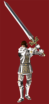
Looks a bit weird due to the non-availability of Ortho mode in any sort of model viewer which renders the textures correctly, but this is more or less what I've been going for. Material of the grip was changed to ivory, battered gold remained in place, although the backdrop of the hilt was changed to a black enamel. I used a technique in photoshop to recreate something similar to what a real damascus pattern would have looked like, albiet larger for visibility's sake. If this looks good I'll need to do a bit more work to prevent the text from getting reversed on the other side of the blade and I'm not sure how many bricks VRS is going to shit trying to run this through there, but I'll find out when it comes to that I suppose. Part of the brilliance of real damascus steel is that only the lighter parts reflect light, causing an appearance of it being banded with silver. Using a good alpha map as well as the correct material attachment, I think this should be possible.
Spoiler: show
-
2013-02-12 07:46 #2589Melee Summoner
- Join Date
- Apr 2010
- Posts
- 41
- BG Level
- 1
- FFXI Server
- Odin
does anyone have a link/list of a more recent model viewer file? i have an altanaview of december but my mv is like a year out of date..
-
2013-02-12 12:05 #2590Old Merits
- Join Date
- Jun 2008
- Posts
- 1,246
- BG Level
- 6
- FFXIV Character
- Zeota Fourier
- FFXIV Server
- Leviathan
- FFXI Server
- Sylph
Mithra! Please, please, pretty please? Originally Posted by Stromgarde
-
2013-02-12 13:02 #2591The Tower
- Join Date
- Apr 2005
- Posts
- 2,160
- BG Level
- 7
- FFXIV Character
- Stromgarde Siren
- FFXIV Server
- Gilgamesh
- FFXI Server
- Siren
Read this: http://www.bluegartr.com/threads/629...57#post5468157
and download the associated zip file. All the tools you need should be in there, just need to use GC3 to change the texture (above) into a .dds file. Once done, use Model Viewer's DAT to MQO button to export the Ragnarok model. This will create 4 files, ragnarok.mqo, ragnarok.mcd, ragnarok0.bmp, and ragnarok0.dds. Use the previously created .dds file with the new texture to overwrite ragnarok0.dds, then go to the File menu in Model Viewer and select MQO to DAT and pick ragnarok.mqo. After acknowledging the subsequent prompt, your Ragnarok will be all shiny and Excalibury.
-
2013-02-12 15:59 #2592Melee Summoner
- Join Date
- Jan 2013
- Posts
- 45
- BG Level
- 1
- FFXI Server
- Sylph
Doubling the dat in vrs to make both sides different shouldn't be too bad. Originally Posted by Stromgarde
I like the new lettering style and the exaggerated wootz/damascus. For me the blade is too dark and the sharpened section too light though. Hard to tell outside of game though model viewers never get it quite right. You might also have an issue in game of the enamel black being too dark/shiny and sticking out like a sore thumb.
Looking at both of the scripts, I still like the Sanskrit since it's more blocky and prominent, It's sweet that you did both though, so folks can have a choice.
-
2013-02-12 18:03 #2593The Tower
- Join Date
- Apr 2005
- Posts
- 2,160
- BG Level
- 7
- FFXIV Character
- Stromgarde Siren
- FFXIV Server
- Gilgamesh
- FFXI Server
- Siren
I'm about to head out the door to go running, but I'll upload a copy of this alpha for you to look at before I do; check your pms. Also, the edge isn't actually that shiny, it's a result of the lighting and the pattern extends into the edge.
Edit: Just going to leave this here

-
2013-02-15 16:03 #2594New Merits
- Join Date
- Apr 2010
- Posts
- 228
- BG Level
- 4
Blue Annihilator and Shield
Spoiler: show
-
2013-02-15 16:34 #2595The Tower
- Join Date
- Apr 2005
- Posts
- 2,160
- BG Level
- 7
- FFXIV Character
- Stromgarde Siren
- FFXIV Server
- Gilgamesh
- FFXI Server
- Siren
1. Flat shading
2. Blue
3. Comic Sans
It's like a well-crafted attack designed for the express purpose of causing me to go blind. Magnificent.
Spoiler: show
-
2013-02-15 16:53 #2596New Merits
- Join Date
- Apr 2010
- Posts
- 228
- BG Level
- 4
There's a lot that can be done with the Comic Sans, because it's not that font. The font is called Torid, and besides I don't see anywhere me asking for an opinion on the font I use.
-
2013-02-15 16:59 #2597D. Ring
- Join Date
- Jul 2008
- Posts
- 4,529
- BG Level
- 7
- FFXI Server
- Phoenix
You're on BG using a Comic Sans-like font, you're going to get commented on.
-
2013-02-15 18:32 #2598Cerberus
- Join Date
- Feb 2008
- Posts
- 463
- BG Level
- 4
- FFXI Server
- Carbuncle
This would be the point where I make a comic sans chocobo to lighten the mood.
-
2013-02-15 19:07 #2599The Tower
- Join Date
- Apr 2005
- Posts
- 2,160
- BG Level
- 7
- FFXIV Character
- Stromgarde Siren
- FFXIV Server
- Gilgamesh
- FFXI Server
- Siren
Mooshy, fixed Wardrobe for ya posted a few days ago:
http://www.elitemmonetwork.com/forum...s&showfile=143
-
2013-02-15 20:03 #2600The 69th Donor
Pens win! Pens Win!!! PENS WIN!!!!!
- Join Date
- Mar 2008
- Posts
- 15,106
- BG Level
- 9
- WoW Realm
- Kil'jaeden
Font or not, I agree about the coloring - muted colors look much better in FFXI. It's not an overly-saturated world. If the blues were a bit toned down those would both look very nice.
 Reply With Quote