XI Wiki


Gonna need more T&A to influence Alleya's vote and mine.Originally Posted by Aksannyi

- Navigation
+ Reply to Thread
Results 41 to 60 of 200
-
2011-05-18 22:32 #41Pay No Attention to the Man Behind the Curtain

- Join Date
- Dec 1969
- Posts
- 3,568
- BG Level
- 7
- FFXIV Character
- Ragns Meuhie
- FFXIV Server
- Gilgamesh
- FFXI Server
- Bahamut
- Blog Entries
- 144


-
2011-05-19 04:50 #42Relic Shield
- Join Date
- Oct 2007
- Posts
- 1,605
- BG Level
- 6
 heh. Originally Posted by Tyche
Millionsknives wins, fatality.
-
2011-05-19 09:15 #43Ranger
9900klub
- Join Date
- Apr 2005
- Posts
- 11,476
- BG Level
- 9
- FFXIV Character
- Sonomaa Kihten
- FFXIV Server
- Gilgamesh
- FFXI Server
- Bahamut
- WoW Realm
- Durotan
- Blog Entries
- 12

its not over guys, I know mknives had an awesome entry but Ive seen bg people make some of the craziest shit that has existed so keep going
-
2011-05-19 09:38 #44Professional Pixel Pusher
- Join Date
- Sep 2007
- Posts
- 2,845
- BG Level
- 7
- FFXI Server
- Ragnarok
My idea is one I think is pretty good, but I don't know if I can pull it together as well as mknives has. I guess it depends on how far people want to take the whole Illuminati "joke".
-
2011-05-19 11:37 #45F5 Like A Boss.
- Join Date
- Sep 2005
- Posts
- 7,445
- BG Level
- 8
- FFXIV Character
- Kuroki Kaze
- FFXIV Server
- Sargatanas
- FFXI Server
- Quetzalcoatl
- WoW Realm
- Twisting Nether

A WIP I'm playing around with. Still not as good as what MK provided. ;x
Hmm maybe the outline would look better on the letters instead of the dragon.
-
2011-05-19 11:54 #46Ranger
9900klub
- Join Date
- Apr 2005
- Posts
- 11,476
- BG Level
- 9
- FFXIV Character
- Sonomaa Kihten
- FFXIV Server
- Gilgamesh
- FFXI Server
- Bahamut
- WoW Realm
- Durotan
- Blog Entries
- 12
that shows promise, me likey
-
2011-05-19 14:11 #47F5 Like A Boss.
- Join Date
- Sep 2005
- Posts
- 7,445
- BG Level
- 8
- FFXIV Character
- Kuroki Kaze
- FFXIV Server
- Sargatanas
- FFXI Server
- Quetzalcoatl
- WoW Realm
- Twisting Nether
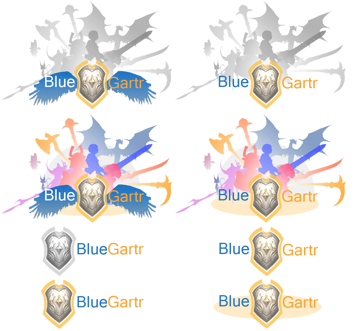
 <--- this with a rectangle that extends from the right edge saying "Blue Gartr"
 <--- random logo
I'll finish it up. Made the glowing circle using a tutorial I found on youtube. lol ;x
-
2011-05-19 14:14 #48
I still don't get the illuminati joke.. but omg i love ambigrams.. the way it looks, is it actually possble to make ambigrams out of any word?
also, I was bored waiting for bastion to happen today so I made this for fun..
This was mainly me trying out a popartish style that i particularly like but have no idea how to actually properly do. but it was a fun attempt anyway..
Sorry if the colors make your eyes bleed, i do that a lot, which is why i made a b/w alternate version lol. also, I realize BG isn't only about FFXI but i was playing with the XI viewer at the time, and um.. BG has its origins in FFXI anyway..
Spoiler: show
as a side-note, do try to see how many bg/ffxi memes you can spot
-
2011-05-19 18:37 #49Professional Pixel Pusher
- Join Date
- Sep 2007
- Posts
- 2,845
- BG Level
- 7
- FFXI Server
- Ragnarok
A challenger appears!
-
2011-05-19 22:46 #50I Am, Who I Am.
- Join Date
- Nov 2005
- Posts
- 15,997
- BG Level
- 9
- FFXIV Character
- Trixi Sephyuyx
- FFXIV Server
- Excalibur
- FFXI Server
- Ragnarok
Try to clear up the jaggies. Originally Posted by Kurokikaze
-
2011-05-19 23:43 #51Fake Numbers
- Join Date
- Mar 2009
- Posts
- 96
- BG Level
- 2
- FFXI Server
- Shiva
Not bad! Originally Posted by Spira
Wish I didn't suck at PS.
-
2011-05-20 00:14 #52You wouldn't know that though because you've demonstrably never picked up a book nor educated yourself on the matter. Let me guess, overweight housewife?
- Join Date
- Mar 2006
- Posts
- 22,966
- BG Level
- 10
- FFXIV Character
- Allyra Arianos
- FFXIV Server
- Sargatanas
- WoW Realm
- Windrunner
 OMG IS THAT CAIT SITH? Originally Posted by Spira
god, now this is getting rough to choose.
-
2011-05-20 07:38 #53Relic Shield
- Join Date
- Oct 2007
- Posts
- 1,605
- BG Level
- 6
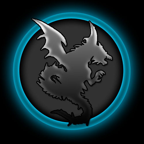
Another one, running with the recent bahamut theme. Poorly executed but this was the general idea:
big.
Spoiler: show
-
2011-05-20 08:29 #54F5 Like A Boss.
- Join Date
- Sep 2005
- Posts
- 7,445
- BG Level
- 8
- FFXIV Character
- Kuroki Kaze
- FFXIV Server
- Sargatanas
- FFXI Server
- Quetzalcoatl
- WoW Realm
- Twisting Nether
Yup been working on that. That is what happens when I start on Paint.net and move over to Photoshop. lol Originally Posted by SephYuyX
Oooo nice one Fallyn.
-
2011-05-20 08:58 #55
o.. very nice..
i love the transparent border effects and the beast head... the blackness of it somehow reminds me of Magic:TG cardset logos
-
2011-05-20 10:18 #56Salvage Bans
- Join Date
- May 2009
- Posts
- 994
- BG Level
- 5
- FFXI Server
- Gilgamesh
From a designers point of view I'm liking the last one by Failyn, though it needs some touchups. Try to make the horns smaller and not reach up as high, they shouldn't be dominating the logo. Also try to even out all the letters and get rid of the white outlines at the spots where the letters touch. Can maybe try to make them flow into each other. If you'd like you can also try to open up Bahamuts mouth a bit more so it doesn't cover the G as much. Very nice entry though, very corporate-ish (my fav style of logos). Can definitely see this on a business card with some work, which is probably what people should be shooting for. Just kinda sad I can't work on an entry myself, don't have the time

-
2011-05-20 12:21 #57Fake Numbers
- Join Date
- Mar 2009
- Posts
- 96
- BG Level
- 2
- FFXI Server
- Shiva
Nice Fallyn. I like that one very much! I think that one is my new favorite.
-
2011-05-20 14:33 #58F5 Like A Boss.
- Join Date
- Sep 2005
- Posts
- 7,445
- BG Level
- 8
- FFXIV Character
- Kuroki Kaze
- FFXIV Server
- Sargatanas
- FFXI Server
- Quetzalcoatl
- WoW Realm
- Twisting Nether

Cleaned it up a bit. Think I've hit a wall on this part. Gonna go look for some fonts to do the "Blue Gartr" portion to the right.
-
2011-05-20 14:54 #59Relic Shield
- Join Date
- Oct 2007
- Posts
- 1,605
- BG Level
- 6
Yeah I'm gunna remake it/redo it tomorrow before work, just tried to get the idea down on the page. Originally Posted by Dominico
-
2011-05-20 16:23 #60F5 Like A Boss.
- Join Date
- Sep 2005
- Posts
- 7,445
- BG Level
- 8
- FFXIV Character
- Kuroki Kaze
- FFXIV Server
- Sargatanas
- FFXI Server
- Quetzalcoatl
- WoW Realm
- Twisting Nether
I need to find some better fonts :/
Spoiler: show


 Reply With Quote