XI Wiki


Love it, apart from the B, move the pillar on it left so it lines up with the rest and it'll be profosho! And maybe put an eye on the Bahamut or something to break up all the colour.Originally Posted by Enedin

- Navigation
+ Reply to Thread
Results 141 to 160 of 200
-
2011-06-04 01:44 #141Relic Shield
- Join Date
- Oct 2007
- Posts
- 1,605
- BG Level
- 6

-
2011-06-04 04:05 #142Melee Summoner
- Join Date
- Nov 2008
- Posts
- 26
- BG Level
- 1
- FFXI Server
- Odin

Guess I'll try. I don't know how to make all those neat dragon-looking things on the fonts, but here goes nothing.
Spoiler: show
-
2011-06-04 05:37 #143Salvage Bans
- Join Date
- Sep 2008
- Posts
- 936
- BG Level
- 5

Nice idea on the b/g, but it needs more work. Adjust the b so that it aligns perfectly with the ring. Your g is slightly tilted where it meets the ring, not sure if that's on purpose. If you use stronger colors and work on the overal composure, I think your idea might work out nicely.
Try giving the b/g a full colour or a mixing gradient that goes from north to south, instead of an outline. Full colours are stronger and therefore much more used in logos. Unless you make a thick, strong ouline in high contrast to the surroundings. Once you have boldness, strength and contrast coming from your concept it'll be much more intense.
-
2011-06-04 11:04 #144Salvage Bans
- Join Date
- Sep 2008
- Posts
- 936
- BG Level
- 5
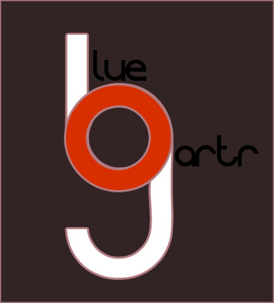
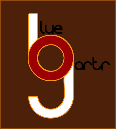
Made the G a lot prettier, worked on the dragon's teeth a bit, adjusted some spacing and shortened the serifs on the B. Also added a light color scheme.
http://enedin.be/www/images/BGL1.png
http://enedin.be/www/images/BGL2.png
http://enedin.be/www/images/BGL3.png
http://enedin.be/www/images/BGL4.png
-
2011-06-04 12:01 #145
I am super-impressed what what y'all are coming up with.
-
2011-06-04 12:59 #146BG's Official Canucks Fan
- Join Date
- Oct 2006
- Posts
- 7,820
- BG Level
- 8
 That is fantastic. Love the way you did the B and G there. Originally Posted by Enedin
Will try taking a serious stab at this tomorrow. For now you get this.

-
2011-06-06 03:29 #147Salvage Bans
- Join Date
- Sep 2008
- Posts
- 936
- BG Level
- 5
So how are we supposed to hand in our final design? A logo isn't just a logo, it involves an overall style and image, which is why I'm making a mini-redesign of the site to show more. And which is why I'm asking the question: serious attempts at this (of which I've seen quite a few in here) involve multiple images, so I'd like to know what people are voting on exactly. 1 image, or an ensemble of images showing the logo's versatility and adaptability.
Other than that, needs moar Comis Sans logos. Can never have enough of those.
-
2011-06-06 06:55 #148Pay No Attention to the Man Behind the Curtain

- Join Date
- Dec 1969
- Posts
- 3,569
- BG Level
- 7
- FFXIV Character
- Ragns Meuhie
- FFXIV Server
- Gilgamesh
- FFXI Server
- Bahamut
- Blog Entries
- 144


 We're gonna vote on each logo concept. In other words: the same logo used twice on a dark background and on a light background count as one entry. Originally Posted by Enedin
Of course we gonna contact you if you win for the final version and probably adapt it some.
-
2011-06-06 15:31 #149New Spam Forum
- Join Date
- Jun 2007
- Posts
- 185
- BG Level
- 3
- FFXI Server
- Gilgamesh
Good competition. Millionknives dropped the freshest one in my opinion. Be nice for the creators to say what program they had used to create their logo as well. If the competition is still going, I may make one as well.
-
2011-06-06 15:35 #150Salvage Bans
- Join Date
- Sep 2008
- Posts
- 936
- BG Level
- 5
I use Adobe Illustrator for this. Things like surfaces and extra effects might be added in Photoshop, but a logo has a few characteristics that encourage the use of Illustrator for logos. Are you familiar with Illustrator? Originally Posted by Artifact
Edit: and yes, the competition is still going. Ends 10th of June. I'm happy about such contests and it's better for every party involved. We should promote these, so if you're keen on showing your work, please share.
-
2011-06-06 15:38 #151New Spam Forum
- Join Date
- Jun 2007
- Posts
- 185
- BG Level
- 3
- FFXI Server
- Gilgamesh
I downloaded it back in the day, but honestly it is a foreign language to me. I usually just use photoshop, and if I need anything fancy I will draw and scan to my PC. I haven't created anything for a video game in a while. Thought this was pretty neat. I remember the days trying to make banners for each LS, and making the websites look appealing. The good old days. Originally Posted by Enedin
-
2011-06-06 15:52 #152Salvage Bans
- Join Date
- Sep 2008
- Posts
- 936
- BG Level
- 5
I advise you to use a program to which you are accustomed, because you need to know as fast as possible how to do something. If most of your time goes to searching how to achieve something, you're not being very efficient with your time.
You gotta stay in touch with the programs though. It's amazing how fast you forget stuff if you don't do it regularly.
-
2011-06-06 15:57 #153New Spam Forum
- Join Date
- Jun 2007
- Posts
- 185
- BG Level
- 3
- FFXI Server
- Gilgamesh
Oh for sure. My photoshop time and patience only came because of how much time I spent on games like FFXI and Socom. It added to my experience for sure and hopefully sticks with me. I tried going to school for it, but Xavier did not offer Graphic Design like most of the other colleges I applied to did. So I guess it will just be a past time, or I will wait for another opportunity.
-
2011-06-06 16:48 #154Salvage Bans
- Join Date
- Sep 2008
- Posts
- 936
- BG Level
- 5
Graphic design is a choice which is never finished. You must always be prepared to reinvent yourself, but that's the beauty of the job. Originally Posted by Artifact
-
2011-06-08 11:40 #155Hydra
- Join Date
- May 2011
- Posts
- 110
- BG Level
- 3
- FFXI Server
- Phoenix
Finally can post something for this...first logo stab in a series. Black and white primarily for all the ones ill post because thats the easiest to print. Color can be added later obviously. More to come.
http://www.tetsuosdream.com/OoBG/almace-OoBG.png
-
2011-06-08 13:20 #156Hydra
- Join Date
- May 2011
- Posts
- 110
- BG Level
- 3
- FFXI Server
- Phoenix
-
2011-06-08 13:23 #157alsohawks
ALL YOU YOUNG HACKEY
PLAYERS OUT THERE
- Join Date
- Jul 2009
- Posts
- 5,960
- BG Level
- 8
fuck yeah, I'm loving this contest. The 2nd image from the 2nd set looks great.
-
2011-06-08 16:28 #158Kunkkaaaaaaa!
- Join Date
- Feb 2008
- Posts
- 442
- BG Level
- 4
- FFXI Server
- Asura
^ this. i'd buy a shirt with that on it lol
-
2011-06-08 16:56 #159Unique and/or Creative Phrase
- Join Date
- Aug 2006
- Posts
- 1,432
- BG Level
- 6
- FFXI Server
- Shiva
There need to be shirts available with the winning logo after this is all over. Throw the proceeds towards the artist, or towards next year's server fees.
-
2011-06-08 22:56 #160RIDE ARMOR
- Join Date
- Dec 2009
- Posts
- 17
- BG Level
- 1
- FFXIV Character
- Priize Rhoop
- FFXIV Server
- Excalibur
- FFXI Server
- Leviathan
God damn, these are so damn awesome. I love it. Makes me want to re-evaluate and try a new design.
 Reply With Quote