XI Wiki


This game definitely needs some UI scaling in place. I don't need the hotbars to be as big as they are currently so it's kinda hard to place stuff exactly where I want them due to overlapping.
- Navigation
+ Reply to Thread
Results 41 to 60 of 305
Thread: Post Pictures of You HUD / UI


-
2013-07-13 17:00 #41D. Ring
- Join Date
- Oct 2004
- Posts
- 4,914
- BG Level
- 7
- FFXIV Character
- Shanoa Varhara
- FFXIV Server
- Excalibur

-
2013-07-13 20:45 #42Relic Horn
- Join Date
- Dec 2005
- Posts
- 3,363
- BG Level
- 7
- FFXIV Character
- Xanthe Celaeno
- FFXIV Server
- Hyperion
- FFXI Server
- Carbuncle
OCD is perfectly overlapping the vertical hotbars so the tiles line up because they don't fit completely end to end on 1080p resolution. Originally Posted by kisada

I believe they said UI scaling would be in P4 or at launch. Originally Posted by Lokus
-
2013-07-13 21:38 #43I'd Rather Be in Zi'Tah
- Join Date
- Aug 2005
- Posts
- 1,266
- BG Level
- 6
- FFXIV Character
- Kaelie Niie
- FFXIV Server
- Gilgamesh
- FFXI Server
- Ramuh
- WoW Realm
- Kilrogg

 I wouldn't say ruined... WoW may have ruined me though. I really wanted to be able to see the party frame be able to be horizontal. Originally Posted by Ksandra
1) Wtf is your res set at? Things looks so damned tiny. Originally Posted by Gulkeeva
2) PS3 limitations may limit hotbars but the cross-bars are 16 while the hotbars are 12. So if you can have 8 different cross-bars and 10 hot-bars. Well things are the same.
Beta 4. Its in the post they made in response to B2 feedback. Originally Posted by Lokus
-
2013-07-13 23:08 #44Egyptian Goddess
- Join Date
- Aug 2008
- Posts
- 194
- BG Level
- 3
- FFXIV Character
- Aiko Matsuo
- FFXIV Server
- Balmung
http://img.photobucket.com/albums/v2...713_041651.png
Like the simple clean look. More space for visuals.
-
2013-07-14 10:12 #45An exploitable mess of a card game
- Join Date
- Sep 2008
- Posts
- 13,258
- BG Level
- 9
- FFXIV Character
- Gouka Mekkyaku
- FFXIV Server
- Gilgamesh
- FFXI Server
- Diabolos
https://dl.dropboxusercontent.com/u/...714_110058.png
New setup. The previous one hid the circle and that helps a ton with sprite-like mobs for PUG positions.
-
2013-07-14 10:39 #46Mithra Ero-Sensei
Sex Manthra
- Join Date
- Nov 2005
- Posts
- 11,547
- BG Level
- 9
- FFXIV Character
- Erosensei Gulkeeva
- FFXIV Server
- Gilgamesh
- FFXI Server
- Cerberus
- WoW Realm
- Magtheridon

 Originally Posted by Yugl
Must be painful in a 4man group, you lose one half of your screen O_o
-
2013-07-14 10:46 #47I Am, Who I Am.
- Join Date
- Nov 2005
- Posts
- 15,997
- BG Level
- 9
- FFXIV Character
- Trixi Sephyuyx
- FFXIV Server
- Excalibur
- FFXI Server
- Ragnarok
I dont recognise any of those buttons on your 7 toolbar? Originally Posted by Null
-
2013-07-14 11:04 #48They call me Lord Null for a reason.
- Join Date
- Aug 2008
- Posts
- 6,518
- BG Level
- 8
They are under "Signs" mostly used to let the party know what targets you want them to go through and in what order. And what targets to not attack.
-
2013-07-14 12:06 #49Chram
- Join Date
- Jun 2007
- Posts
- 2,842
- BG Level
- 7
- FFXIV Character
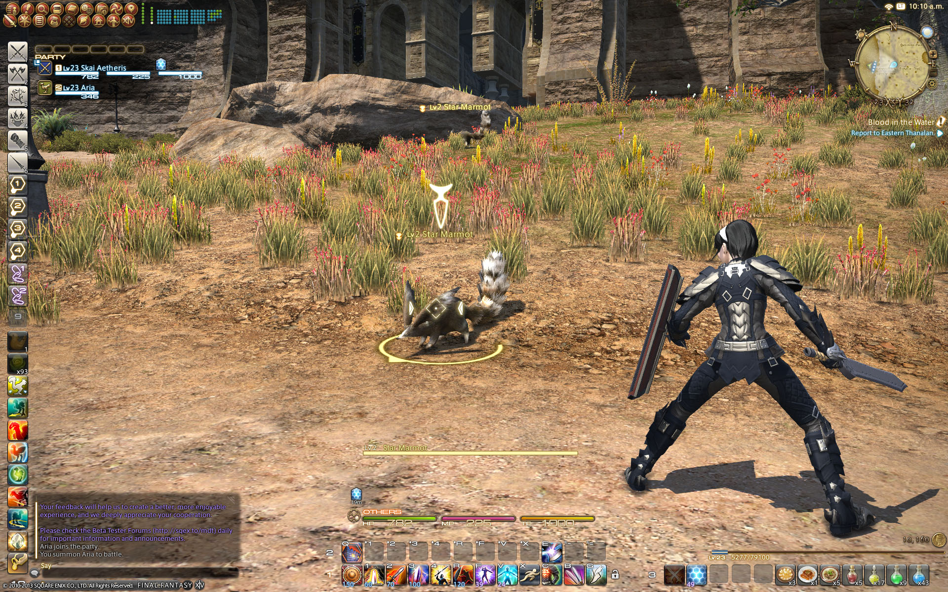
- Skai Aetheris
- FFXIV Server
- Gilgamesh
Like some of the ideas I found here and adopted it. Can't wait until phase 4/retail when I can hide all those stuff I don't need to see (i.e. menu, inventory, gil, exp.).
-
2013-07-14 16:35 #50Relic Shield
- Join Date
- Jul 2007
- Posts
- 1,664
- BG Level
- 6
- FFXIV Character
- Issah Grimes
- FFXIV Server
- Balmung
- FFXI Server
- Phoenix
We get to remove UI elements!? oh man this changes everything. Fuck the stupid inventory and mini menu
-
2013-07-14 16:50 #51Chram
- Join Date
- Jun 2007
- Posts
- 2,842
- BG Level
- 7
- FFXIV Character
- Skai Aetheris
- FFXIV Server
- Gilgamesh
Yeah it's currently locked out in the system configuration, amongst other things like shared hot bars between classes.
-
2013-07-14 17:26 #52D. Ring
- Join Date
- Oct 2004
- Posts
- 4,914
- BG Level
- 7
- FFXIV Character
- Shanoa Varhara
- FFXIV Server
- Excalibur

I'll most likely move the combat chat back to the main window since currently, it's really not that important to look at it since every buff and enemy skill is animated on your character/target bar.
-
2013-07-14 19:17 #53I'd Rather Be in Zi'Tah
- Join Date
- Aug 2005
- Posts
- 1,266
- BG Level
- 6
- FFXIV Character
- Kaelie Niie
- FFXIV Server
- Gilgamesh
- FFXI Server
- Ramuh
- WoW Realm
- Kilrogg
How exactly do you set the focus target? I have been trying to figure it out for a while and havent gotten a straight answer.
-
2013-07-14 19:18 #54Chram
- Join Date
- Jun 2007
- Posts
- 2,842
- BG Level
- 7
- FFXIV Character
- Skai Aetheris
- FFXIV Server
- Gilgamesh
Shift+F, or you can change it at Keybind > Targeting > Set Focus Target.
-
2013-07-14 20:09 #55I'd Rather Be in Zi'Tah
- Join Date
- Aug 2005
- Posts
- 1,266
- BG Level
- 6
- FFXIV Character
- Kaelie Niie
- FFXIV Server
- Gilgamesh
- FFXI Server
- Ramuh
- WoW Realm
- Kilrogg
Thanks much
-
2013-07-14 20:45 #56Relic Horn
- Join Date
- Apr 2009
- Posts
- 3,154
- BG Level
- 7
Keybind options pretty much tells you everything. :3
-
2013-07-14 22:18 #57I'd Rather Be in Zi'Tah
- Join Date
- Aug 2005
- Posts
- 1,266
- BG Level
- 6
- FFXIV Character
- Kaelie Niie
- FFXIV Server
- Gilgamesh
- FFXI Server
- Ramuh
- WoW Realm
- Kilrogg
Yeah, somehow I overlooked it.
-
2013-07-14 22:46 #58MOST RAD.
- Join Date
- Oct 2007
- Posts
- 1,727
- BG Level
- 6
- FFXIV Character
- Pupuru Puru
- FFXIV Server
- Goblin
- FFXI Server
- Ragnarok
Going with this layout. Divided the screen in thirds. I see no need for the vertical bars.

-
2013-07-14 22:58 #59E. Body
- Join Date
- Aug 2005
- Posts
- 2,242
- BG Level
- 7
- FFXI Server
- Bahamut
That said, how do you add that to a macro? <focus> ? Originally Posted by Skai
-
2013-07-14 23:31 #60The Defense is ready, Your Honor
- Join Date
- Sep 2007
- Posts
- 20,340
- BG Level
- 10
- FFXIV Character
- Lord Longhaft
- FFXIV Server
- Gilgamesh
- FFXI Server
- Cerberus
- WoW Realm
- Mug'thol
This is pretty close to what I'll run in P4. Perhaps a few adjustments here or there.
 Reply With Quote