 XI Wiki


psh i keep apartment sent on 61 lol id kill for air at work but we dont have any ac there.Originally Posted by Melena

- Navigation
Results 16121 to 16140 of 24062
-
2016-05-06 18:57 #16121EAST BAY JEDI DONT GIVE A FUCK

- Join Date
- Oct 2006
- Posts
- 2,152
- BG Level
- 7

-
2016-05-06 18:57 #16122HABS SUCK!!!!!
Sepukku is my Hero
Therrien's Cum Dumpster
- Join Date
- Mar 2005
- Posts
- 37,884
- BG Level
- 10
- FFXI Server
- Gilgamesh
 Bro Originally Posted by Boyiee
You never shop hungry, thats like rule #3
-
2016-05-06 19:03 #16123Ironing this Thread
Sweaty Dick Punching Enthusiast
- Join Date
- Feb 2006
- Posts
- 21,329
- BG Level
- 10
- FFXIV Character
- Boyiee Star
- FFXIV Server
- Gilgamesh
- WoW Realm
- Kel'Thuzad
 Yeah I know I was just popping in after picking up dry cleaning. Even went in my 2 door car so it wouldn't happen. Originally Posted by NynJa
-
2016-05-06 20:10 #16124
Sweaty Dick Punching Enthusiast
- Join Date
- Mar 2010
- Posts
- 24,345
- BG Level
- 10
- FFXI Server
- Quetzalcoatl
Rule #4 is don't go to the bar when you're horny, for pretty much the same reason. Originally Posted by NynJa
-
2016-05-06 20:44 #16125You wouldn't know that though because you've demonstrably never picked up a book nor educated yourself on the matter. Let me guess, overweight housewife?
- Join Date
- Mar 2006
- Posts
- 22,830
- BG Level
- 10
- FFXIV Character
- Allyra Arianos
- FFXIV Server
- Sargatanas
- WoW Realm
- Windrunner
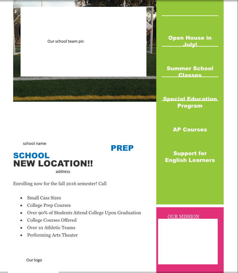
 So spent 5 hours the past weekend making the flyer. It turned out pretty damn nice (see below). I sent them the file on Monday, Tuesday the marketing chick was like "we plan to pay you but I already hired a graphic designer to do all the stuff." Originally Posted by Ksandra
At first I was a bit bitter because of the effort I put in. But I got over it. I'm not a professional, and let's face it, the job that took my five hours to do probably would take a regular person like 30 minutes. Until today when I saw the flyer that the guy did. I found out they paid some dude $100 to make the same damn flyer that she initially showed me. The only difference between hers and his was one color and he changed the picture.
I had to take out a lot of personal info, but you should get the idea.
Her initial flyer (note the lines are not really off on hers, she just made it in word and google docs always offsets lines):
What I made:

I don't have a pic of the graphic guy's flyer but it's hers with a darker green for the box on the right and he changed the team picture to some picture of kids in like red outfits (our uniform is blue).
I mean, again, I am no professional. I know some people on BG with better shop knowledge could shred it to pieces. But I do feel like my work was way better than theirs. Many people are pissed that our students are not being displayed. If anything, hire someone that is going to do a nice flyer, not some basic word shit.
I have to see the chick next week to discuss my "payment." I should ask for more than $100, but I am a wuss and know I won't. ;_;
-
2016-05-06 20:45 #16126HABS SUCK!!!!!
Sepukku is my Hero
Therrien's Cum Dumpster
- Join Date
- Mar 2005
- Posts
- 37,884
- BG Level
- 10
- FFXI Server
- Gilgamesh
Well if that rule were enforced, men would never go to the bar Originally Posted by Anoat
-
2016-05-06 21:04 #16127
Sweaty Dick Punching Enthusiast
- Join Date
- Jan 2010
- Posts
- 9,355
- BG Level
- 8
- FFXI Server
- Leviathan
Pretty sure you go to the bar because you're horny
-
2016-05-06 21:15 #16128BG Content
- Join Date
- Sep 2011
- Posts
- 707
- BG Level
- 5
- FFXIV Character
- Modoru D'kkoru
- FFXIV Server
- Hyperion
- FFXI Server
- Siren
Oh, hun. Originally Posted by Ksandra
Bevels are so 2000.
No, but really -- flat colours and good colour palette will always look better, imo.
also did you get that background off the internet or did you make it?
Decent job for not knowing much PS anyway, grats!
-
2016-05-06 21:27 #16129You wouldn't know that though because you've demonstrably never picked up a book nor educated yourself on the matter. Let me guess, overweight housewife?
- Join Date
- Mar 2006
- Posts
- 22,830
- BG Level
- 10
- FFXIV Character
- Allyra Arianos
- FFXIV Server
- Sargatanas
- WoW Realm
- Windrunner
I don't know what any of that means. Originally Posted by Modoru
The background came from this:

Are you trying to say her shit is better?
-
2016-05-06 21:40 #16130Nidhogg
- Join Date
- Apr 2007
- Posts
- 3,895
- BG Level
- 7
I'm on mobile and I'm leaning towards yes, hers is better honest critique.
I will look on computer and see if that changes my opinion but hers is streamlined and light. Yours is too much. I'm a simpleton who is very high at the gym and just did a buncha cardiovascular and a little light headed so who knows my perception might be a bit skewed.
-
2016-05-07 00:06 #16131Nidhogg
- Join Date
- Apr 2007
- Posts
- 3,895
- BG Level
- 7
On computer. Yes. The first flyer is better.
Sorry Ksan. Yours is good work and I know you put time and effort into it. I'm sorry it was effort that wasn't put to use really. Internet hugs. :3
-
2016-05-07 00:21 #16132You wouldn't know that though because you've demonstrably never picked up a book nor educated yourself on the matter. Let me guess, overweight housewife?
- Join Date
- Mar 2006
- Posts
- 22,830
- BG Level
- 10
- FFXIV Character
- Allyra Arianos
- FFXIV Server
- Sargatanas
- WoW Realm
- Windrunner
If people want to say they would be more likely to look at a school with the first flyer than the second I will concede, but I just don't see it. Despite me making the second, when I saw the first I thought it looked cheap. Most teachers (before I was even asked to do it mind you), also were upset that it looked cheap. However, if marketing shows that more parents would actually inquire from the first than the second, than that is what needs to be done. I still suspect it though. If, from my experience, everyday people don't like the look, then how can it be a good marketing idea when you are catering to them?
As well, I didn't just come up with the layout per se, but looked at other school flyers. In particular I was trying to give the same feel as this one:

Which was on a site listing what they felt were the best type of flyers for marketing. Now, I obviously don't have the skills to do the kid image on the bottom, but I think I had the same concept. A lot of school flyers I saw did some kind of swirl for the background with about 3-5 student images.
But again, if people on bg say they'd be more likely to inquire a school based on the first than the second, then that's that. I will not bend on my (and other teachers) frustration over the picture, though. It didn't even have any Hispanic students. We are 100% Hispanic.
-
2016-05-07 00:26 #16133Because She's the woman Blue Gartr deserves, but not the one it needs right now.
- Join Date
- May 2014
- Posts
- 3,542
- BG Level
- 7
- WoW Realm
- Zul'jin
The second feels so overburdened and busy I can't be sure what the focus is personally. The top as streamlined as it is and unappealing color palette tells me more.
-
2016-05-07 09:33 #16134
Sweaty Dick Punching Enthusiast
- Join Date
- Mar 2010
- Posts
- 24,345
- BG Level
- 10
- FFXI Server
- Quetzalcoatl
"Enrolments" on a school flyer.

-
2016-05-07 09:38 #16135
- Join Date
- Oct 2006
- Posts
- 22,163
- BG Level
- 10
- FFXIV Character
- Zetanio Breaux
- FFXIV Server
- Gilgamesh
- FFXI Server
- Odin
Yeah, those are all pretty bad if I'm honest.
-
2016-05-07 09:50 #16136The Anti Miz
The Anti Miz of the House of Weave
- Join Date
- Feb 2007
- Posts
- 32,666
- BG Level
- 10
Here is what i have learned. More flashy/busy shit always appeals to non designers. I mean have you guys seen what that chump CEO did with the Uber logo when he decided to redesign it himself? LOL

As far as the school flyers. The first one at least has a good template? (idk if template is the right word) but the fonts are a show, need to flip their serif and sans. If you were to look at flyer from a succesful realtor, it would have a similar layout. Ksan I think yours looks good for what it is but it is busy like a power point slide on steroids.
-
2016-05-07 09:51 #16137BG's most likeable Québécois
Pens win! Pens Win!!! PENS WIN!!!!!
- Join Date
- Sep 2007
- Posts
- 37,887
- BG Level
- 10

My debit card got cloned near the end of April/start of may, and the guy rent 7500$ on my credit line, changed my adress and opened a new account with my name and withdraw 4500 of that 7500$ from the credit line.
Now all my accounts are frozen until my bank does an investigation.
Since i never get cash and always pay with debit, i'm kinda poor for now.
She said i lost 0 $ from my main account but still sucks
-
2016-05-07 09:53 #16138
- Join Date
- Oct 2006
- Posts
- 22,163
- BG Level
- 10
- FFXIV Character
- Zetanio Breaux
- FFXIV Server
- Gilgamesh
- FFXI Server
- Odin
This is why credit monitoring is important.
-
2016-05-07 10:11 #16139You wouldn't know that though because you've demonstrably never picked up a book nor educated yourself on the matter. Let me guess, overweight housewife?
- Join Date
- Mar 2006
- Posts
- 22,830
- BG Level
- 10
- FFXIV Character
- Allyra Arianos
- FFXIV Server
- Sargatanas
- WoW Realm
- Windrunner
I can't quote for some reason.
To my flyer: busy stuff could be removed, that's the thing. Mine was a template to work from. A rough draft if you will. Pictures could easily be removed, repositioned, etc. I was going off what she told me to do. Whereas hers was the final copy. Just google school flyer and you'll see a fuckton similar to mine.
I found out last night the Guidance Counselor (has a graphic design background, didn't have any idea I was asked to do this or saw my version at the time) is hella pissed at the woman's flyer. I guess they handed a shit ton out earlier this week, and got zero calls about the school. She said when she handed them out people barely looked at them.
Again, I am not trying to push I was amazing or anything. I have said several times I have zero background in this shit. What I do want to push is that they picked a shitty format. People aren't going to read it, and it's already showing to be the case. Hire a real dude if you want enrollment for Christ's sake.
@ Tyven, but you bring up a good point. The feel of a realtor flyer should be different than a school. The school is to cater more to kids to push their parents to go there, a realtor is focusing on adults.
-
2016-05-07 10:13 #16140
- Join Date
- Oct 2006
- Posts
- 22,163
- BG Level
- 10
- FFXIV Character
- Zetanio Breaux
- FFXIV Server
- Gilgamesh
- FFXI Server
- Odin
Why do people still flyer anyway? Honest question.
Wouldn't any effort be better spent creating an online presence?

