 XI Wiki


Pretty much.Originally Posted by Mote

- Navigation
Results 9221 to 9240 of 13142
-
2013-06-04 07:34 #9221Annihilation Banwave

sprout sprout sprout
2031 No.1 Draft Pick
Pittsburgh Penguins
Sweaty Dick Punching Enthusiast
- Join Date
- Aug 2006
- Posts
- 19,830
- BG Level
- 9
- FFXI Server
- Bismarck

-
2013-06-04 07:49 #9222BG's worst Rangers fan
Fleury 2; Lundqvist 0
Sweaty Dick Punching Enthusiast
- Join Date
- Nov 2007
- Posts
- 23,755
- BG Level
- 10
- FFXIV Character
- Bad Karma
- FFXIV Server
- Hyperion
- FFXI Server
- Quetzalcoatl
- WoW Realm
- Kel'Thuzad
<3 you Brill. Its ok. Soon you can join the Boston beat us club
-
2013-06-04 07:52 #9223BG's worst Rangers fan
Fleury 2; Lundqvist 0
Sweaty Dick Punching Enthusiast
- Join Date
- Nov 2007
- Posts
- 23,755
- BG Level
- 10
- FFXIV Character
- Bad Karma
- FFXIV Server
- Hyperion
- FFXI Server
- Quetzalcoatl
- WoW Realm
- Kel'Thuzad
Im excited to see the new canes jerseys
-
2013-06-04 07:59 #9224Mr. Anna Kendrick
BGs Worst Golde Abuser
- Join Date
- Jul 2007
- Posts
- 10,999
- BG Level
- 9
- FFXIV Character
- Charles Barkley
- FFXIV Server
- Faerie
- FFXI Server
- Quetzalcoatl
didn't you know maz? whatever you say, you're wrong. Originally Posted by Mazmaz
-
2013-06-04 08:41 #9225
SASSAGE KING OF DA WORLD
cheap hawks gay
- Join Date
- Sep 2007
- Posts
- 26,424
- BG Level
- 10
stupid Pens jeopardizing my thread title accuracy rate
-
2013-06-04 09:47 #9226Piece of shit Bruins fan

- Join Date
- Jun 2008
- Posts
- 5,520
- BG Level
- 8
- FFXIV Character
- Beat Daisukenojo
- FFXIV Server
- Hyperion


-
2013-06-04 09:48 #9227
- Join Date
- Jul 2007
- Posts
- 58,034
- BG Level
- 10
- FFXI Server
- Ifrit

bahaha
-
2013-06-04 10:10 #9228
- Join Date
- Jul 2006
- Posts
- 6,936
- BG Level
- 8
nbc needs to get some fucking better announcers btw, game was so awful to listen to
-
2013-06-04 10:29 #9229Pens win! Pens Win!!! PENS WIN!!!!!
- Join Date
- Jul 2008
- Posts
- 8,637
- BG Level
- 8
I can definitely see why everyone hates Marchand, though. He is a very cocky player and full of himself at times, like he was last night after he scored his second goal. His first thing he did after he scored it was to pop his chest out and yell "What? What? You were saying?" to Matt Cooke, I believe. You could see it in the replay. Can't deny he is a good goal scorer though, and elusive.
-
2013-06-04 10:38 #9230
SASSAGE KING OF DA WORLD
cheap hawks gay
- Join Date
- Sep 2007
- Posts
- 26,424
- BG Level
- 10
uhh, nobody cares about his goal celebrations, they take issue with him making dirty hits several times a season and starting skirmishes then hiding behind Chara/Ference instead of fighting in things he starts. Originally Posted by bori
-
2013-06-04 10:40 #9231Annihilation Banwave
sprout sprout sprout
2031 No.1 Draft Pick
Pittsburgh Penguins
Sweaty Dick Punching Enthusiast
- Join Date
- Aug 2006
- Posts
- 19,830
- BG Level
- 9
- FFXI Server
- Bismarck
This. Boarding Neal, slew footing Crosby, etc. The last thing I care about is how Marchand celebrates a goal lol. Originally Posted by Callisto
-
2013-06-04 10:43 #9232Piece of shit Bruins fan
- Join Date
- Jun 2008
- Posts
- 5,520
- BG Level
- 8
- FFXIV Character
- Beat Daisukenojo
- FFXIV Server
- Hyperion
Yeah, I'll second this. I'm not keen on players that act like they're hot shit, 'cuz when they're off their game, it's really easy to laugh at them and they tend to have just as much negativity when the chips are down. Originally Posted by bori
-
2013-06-04 11:38 #9233Relic Shield
- Join Date
- Sep 2008
- Posts
- 1,553
- BG Level
- 6
- FFXI Server
- Valefor
I present to you the new look Carolina Coyotes:
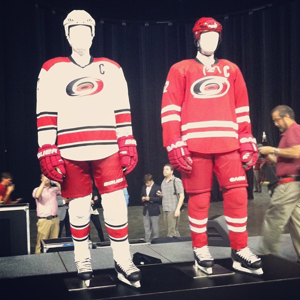
meh
edit: I actually like the white jersey more than the old one sort of. I hate losing the square ribbon of warning flags. The new red jersey is meh though!
-
2013-06-04 11:39 #9234FOR FUCKS' SAKE !!!
FOR FUCKS' SAKE !!!
FUCK FUCK FUCK
- Join Date
- Mar 2010
- Posts
- 14,680
- BG Level
- 9

Eh.
-
2013-06-04 11:44 #9235
SASSAGE KING OF DA WORLD
cheap hawks gay
- Join Date
- Sep 2007
- Posts
- 26,424
- BG Level
- 10
Yeah I liked the square pattern piping, seems odd that they made it plainer
-
2013-06-04 11:46 #9236Annihilation Banwave
sprout sprout sprout
2031 No.1 Draft Pick
Pittsburgh Penguins
Sweaty Dick Punching Enthusiast
- Join Date
- Aug 2006
- Posts
- 19,830
- BG Level
- 9
- FFXI Server
- Bismarck
Yeah that uniform is extremely simple. But I don't care about other team's uniforms. Unless the Isles bring back the Gordon's fisherman. Which in that case I will be happy.
-
2013-06-04 11:48 #9237
SASSAGE KING OF DA WORLD
cheap hawks gay
- Join Date
- Sep 2007
- Posts
- 26,424
- BG Level
- 10
I think it's one thing to stick with a simple, classic design if you're something like an original six team, but for newer teams I like the jerseys with all the intricate little touches, like the newer Preds home jerseys.
-
2013-06-04 11:54 #9238a p. sweet dude
Pens win! Pens Win!!! PENS WIN!!!!!
- Join Date
- Jul 2010
- Posts
- 25,814
- BG Level
- 10
The yellow Preds jersies are one of my favorites in the league.
-
2013-06-04 11:56 #9239TOO MUCH MAN
- Join Date
- Sep 2005
- Posts
- 8,264
- BG Level
- 8
They look pretty good, except that they are incredibly bland.
-
2013-06-04 11:57 #9240Relic Shield
- Join Date
- Sep 2008
- Posts
- 1,553
- BG Level
- 6
- FFXI Server
- Valefor
I think it's clearly the new fad with jersey redesign to go old school: add the laces and maybe focus on two colors. The problem is the Canes logo didn't get redesigned to go with the old school look so it looks weird. I like the white jersey because it look more early 90s (reminds me of the devils old jersey) and it fits with the logo more compared to the red.
I think when Tampa Bay redid theirs it looked pretty good as an old school approach but they redid the logo to fit in with it.


Similar Threads
-
2013 NHL Season Thread: TUUKKA RASK, HE'S FROM FINLAND, AND IS INELIGIBLE TO BECOME MAYOR
By Callisto in forum SportsReplies: 16499Last Post: 2013-04-29, 06:20 -
2011-2012 NHL Playoff Thread: MOOSE NOOSE ON THE LOOSE
By Callisto in forum SportsReplies: 11291Last Post: 2012-06-15, 09:02 -
2010-11 NHL Playoff Thread: HOUSE RULES: ENGAGED
By Callisto in forum SportsReplies: 8596Last Post: 2011-06-17, 07:09 -
2009-10 NHL Playoff Thread: DREAM BIG AND GO BLACKHAWKS MOTHERBITCHERS
By Callisto in forum SportsReplies: 6664Last Post: 2010-06-14, 00:40 -
The official '07 NHL Playoff Thread
By Norelco in forum SportsReplies: 80Last Post: 2007-05-05, 12:08