 XI Wiki


looks like a chargers logo lol
- Navigation
Results 241 to 260 of 2864
-
2020-03-08 17:58 #241

- Join Date
- Jul 2007
- Posts
- 58,184
- BG Level
- 10
- FFXI Server
- Ifrit


-
2020-03-08 18:05 #242I'm almost as bad as Mazmaz
Sweaty Dick Punching Enthusiast
- Join Date
- Jul 2008
- Posts
- 26,309
- BG Level
- 10

wheres the ram portion of the logo
-
2020-03-08 18:06 #243Mr. Bananagrabber
Sweaty Dick Punching Enthusiast
- Join Date
- Dec 2005
- Posts
- 55,916
- BG Level
- 10
- FFXI Server
- Asura
God that's fucking horrible
-
2020-03-08 18:10 #244Cardiac Cat
- Join Date
- Nov 2006
- Posts
- 11,604
- BG Level
- 9
- FFXIV Character
- Airlea Ocelot
- FFXIV Server
- Balmung
- FFXI Server
- Bahamut
- WoW Realm
- Aegwynn
Wowwwwwww lol
Sent from my SM-G960U using Tapatalk
-
2020-03-08 18:15 #245Cardiac Cat
- Join Date
- Nov 2006
- Posts
- 11,604
- BG Level
- 9
- FFXIV Character
- Airlea Ocelot
- FFXIV Server
- Balmung
- FFXI Server
- Bahamut
- WoW Realm
- Aegwynn
If I was a fan I still couldn't wear that hat.
Sent from my SM-G960U using Tapatalk
-
2020-03-08 18:19 #246I would prefer not to.

Moms Spaghetti
Philly Special
- Join Date
- May 2006
- Posts
- 39,975
- BG Level
- 10
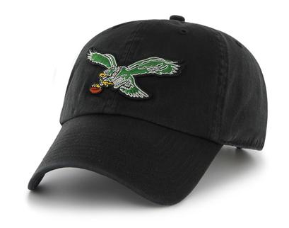
could always stick with the retro. i still rock the retro eagles logo
-
2020-03-08 18:25 #247Cardiac Cat
- Join Date
- Nov 2006
- Posts
- 11,604
- BG Level
- 9
- FFXIV Character
- Airlea Ocelot
- FFXIV Server
- Balmung
- FFXI Server
- Bahamut
- WoW Realm
- Aegwynn
The original Rams logo was dope af. Never saw it until just now. Like, it's better than any modern iterations. Originally Posted by Mertron

Neat little side fact that they were the first team to actually have a logo on their helmet.
You're on to something Mert
Sent from my SM-G960U using Tapatalk
-
2020-03-08 18:26 #248Cardiac Cat
- Join Date
- Nov 2006
- Posts
- 11,604
- BG Level
- 9
- FFXIV Character
- Airlea Ocelot
- FFXIV Server
- Balmung
- FFXI Server
- Bahamut
- WoW Realm
- Aegwynn
I can always go wayyyyyyyyy back to the retro Panthers logo

Sent from my SM-G960U using Tapatalk
-
2020-03-08 18:27 #249Been Here Longer Than you
- Join Date
- Jan 2005
- Posts
- 36,105
- BG Level
- 10
Light green Eagles was hard. So much better than the crap they currently have.
Also wtf, I legit thought that was the Chargers new logo....
-
2020-03-08 18:51 #250BG Content
- Join Date
- Oct 2005
- Posts
- 70,762
- BG Level
- 10
- FFXIV Character
- Six Souls
- FFXIV Server
- Gilgamesh
- FFXI Server
- Quetzalcoatl
- WoW Realm
- Malorne
- Blog Entries
- 9
 New slogan, too. Originally Posted by Mertron
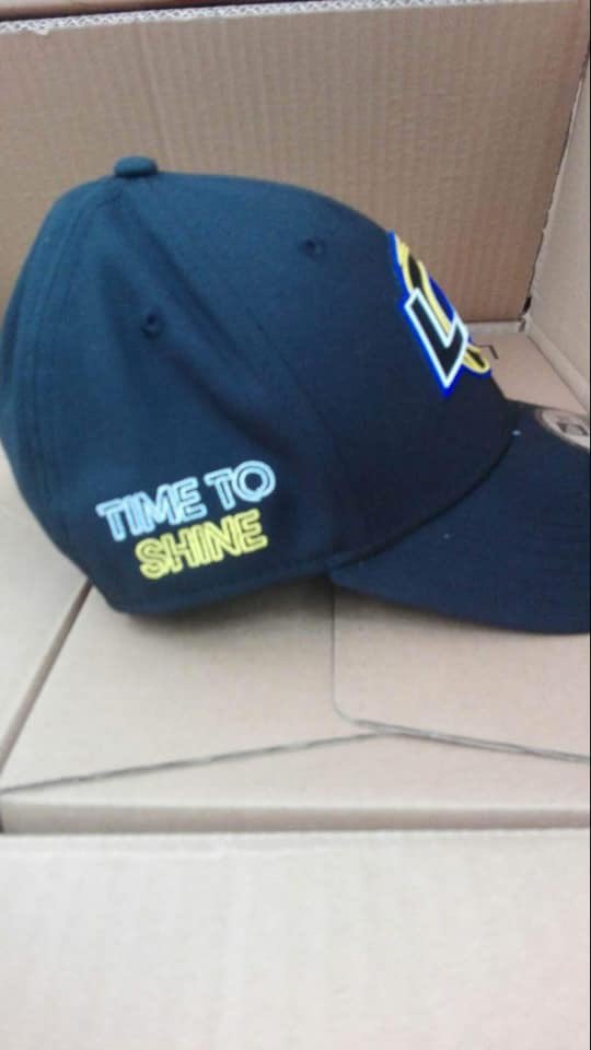
https://trademarks.justia.com/880/86...-88086013.html
-
2020-03-08 18:53 #251BG Content
- Join Date
- Oct 2005
- Posts
- 70,762
- BG Level
- 10
- FFXIV Character
- Six Souls
- FFXIV Server
- Gilgamesh
- FFXI Server
- Quetzalcoatl
- WoW Realm
- Malorne
- Blog Entries
- 9

-
2020-03-08 18:54 #252Been Here Longer Than you
- Join Date
- Jan 2005
- Posts
- 36,105
- BG Level
- 10
The yellow part not only looks like a lightning bolt, but it is in the shape of a 'C'. They could not have done any worse, given the Chargers share the city/stadium lmao.
-
2020-03-08 19:06 #253Mr. Bananagrabber
Sweaty Dick Punching Enthusiast
- Join Date
- Dec 2005
- Posts
- 55,916
- BG Level
- 10
- FFXI Server
- Asura
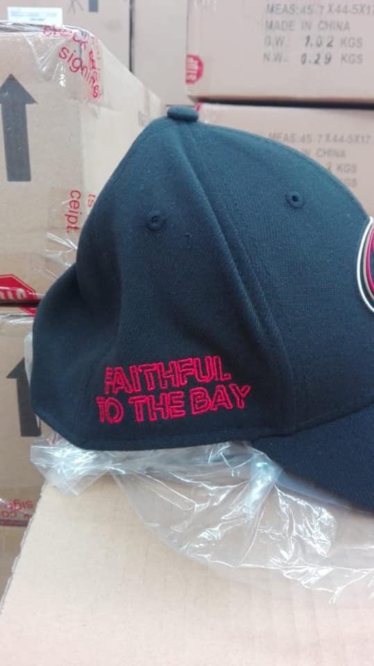
Yeah I want no part of these hats with the slogans on the side, looks tacky as hell
-
2020-03-08 20:03 #254
Sweaty Dick Punching Enthusiast
- Join Date
- Nov 2007
- Posts
- 51,880
- BG Level
- 10

That new chargers logo had to be done on purpose. Goodell is doing everything possible to prop up the LA fanbase.
-
2020-03-08 20:44 #255Member since 2006 and still can't think of a title.
- Join Date
- Oct 2006
- Posts
- 28,754
- BG Level
- 10
- FFXIV Character
- Acanis Lindri
- FFXIV Server
- Midgardsormr
- FFXI Server
- Bismarck
- WoW Realm
- Kil'jaeden
God I'd wear the Niners hat ifbit wasn't for the slogan. I love their red & black uniforms
Sent from my SM-G975U using Tapatalk
-
2020-03-08 21:00 #256Been Here Longer Than you
- Join Date
- Jan 2005
- Posts
- 36,105
- BG Level
- 10
Yeah, the 49er hat looks kinda dope, minus the slogan.
-
2020-03-09 10:41 #257
- Join Date
- Jul 2007
- Posts
- 58,184
- BG Level
- 10
- FFXI Server
- Ifrit
-
2020-03-09 11:33 #258I'm almost as bad as Mazmaz
Sweaty Dick Punching Enthusiast
- Join Date
- Jul 2008
- Posts
- 26,309
- BG Level
- 10
his lawyers also thought he'd make a fortune from the nfl regarding the "blackballed" shit.
-
2020-03-09 11:38 #259I would prefer not to.
Moms Spaghetti
Philly Special
- Join Date
- May 2006
- Posts
- 39,975
- BG Level
- 10
that entire summary is hilariously stupid
they actually compare the length of player careers to how long owners own their team
-
2020-03-09 11:41 #260I would prefer not to.
Moms Spaghetti
Philly Special
- Join Date
- May 2006
- Posts
- 39,975
- BG Level
- 10
is this from the law offices of bob loblaw
“MORE GAMES. MORE PLAYS. MORE INJURIES. SHORTER CAREERS.”
k


Similar Threads
-
2019 NFL Off-Season Thread: Kraft Handys
By Cail in forum SportsReplies: 1293Last Post: 2019-07-31, 11:51 -
2017 NFL Draft + Off-season Thread: Which players' lives will be fucked by Cleveland this year?
By Cail in forum SportsReplies: 556Last Post: 2017-08-05, 16:04 -
2016 NFL Off-season Thread: Sheriff of a Lawless Land
By Bregor in forum SportsReplies: 1208Last Post: 2016-09-07, 18:58 -
2015 NFL Off-Season Thread: Fuck tom
By Cail in forum SportsReplies: 4245Last Post: 2015-08-09, 22:56 -
2014 NFL Off-season Thread: The Prince and the Piece of Shit
By Bregor in forum SportsReplies: 2422Last Post: 2014-07-31, 02:16 -
2013 NHL Off-Season Thread: Bluefan's Own Personal Crying Game!
By Callisto in forum SportsReplies: 3792Last Post: 2013-09-29, 20:04 -
2013 NFL Off-season Thread: pretty sure someone is gonna die today
By Bregor in forum SportsReplies: 1973Last Post: 2013-04-25, 04:32 -
2012 NBA Draft/Off-Season Thread: Have you stopped beating your wife yet?
By Cail in forum SportsReplies: 609Last Post: 2012-10-30, 16:08